Ultimate Guide: 101 Accessibility Tips and Tricks! (a 16750 word monster reference piece!)
If you manage to read it one sitting, well done!

Hey peeps, yes I have written a listicle. Don't worry I am OK. May I present 101 Accessibility tips and tricks. So if you have a minute (or an hour! OK...75 minutes!) please give it a read. I hope you find it interesting!
Note: It is not designed as something to just sit and read, pick one point (or a section) a day to read and then learn more about. Keep coming back every couple of days until you get through it. Then keep it bookmarked as a reference piece!
Oh and in case you didn't know, accessibility means making your product, service etc. usable for people with disabilities.
So whether you are completely new to accessibility, dabbled a bit, or know your stuff...I hope there is something in this listicle for everyone and I truly hope you enjoy it!
stats for geeks:
- 107,000+ characters excluding fiddles
- 16,750+ words - or roughly 55 pages of a book!
- 38 code blocks
- 4 jsFiddles
- 19 images
- 115 links
- 20+ hours to write and edit
- One tired boy
Contents
- Developer Tips (and general tips)
- Document Structure
- Forms
- Images
- Language
- Navigation
- Presentation and Design
- Semantics
- Social Media
- Tables
- Testing
- Usability
- Videos
- WAI-ARIA
Developer Tips (and General Tips)

Let's start with some general developer tips when it comes to tackling accessibility.
1. Thinking of personas can help
Often with accessibility the biggest problem is remembering what and who you actually have to consider when developing. There is a lot to remember (over 100 different impairments)!
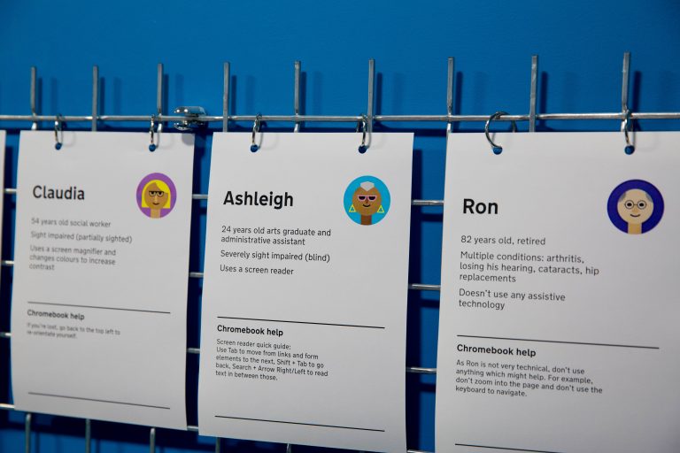 Image Source: https://accessibility.blog.gov.uk
Personas are a great way to remember all of the different types of impairments people may have and how you can avoid creating barriers for those people (or negate barriers) in your code.
GOV.UK did a great write-up on personas that I would highly recommend reading. It really helps frame why you need to do something and who you are helping!
2. Some great resources
This is by no means an exhaustive list, just big enough to contain useful information, small enough that it isn't overwhelming!
- Introduction to Web Accessibility - Web Aim - great for understanding why and who our work affects!
- Dennis Boudreau's blog - a little bit old but nearly everything still applies and the way they present the information is easy to digest.
- The a11y project - If they just changed the name to "the accessibility project" and stopped using a numeronym (as numeronyms are not very accessible) it would be perfect!
Oh and obviously I need to introduce you to the key reference points:-
- Web Content Accessibility Guidelines (WCAG) - hard to read but they are the standard that nearly every Country works to.
- Authoring Tool Accessibility Guidelines (ATAG) - if you build a Content Management System (CMS) or a What You See Is What You Get (WYSIWYG) editor then these are the guidelines you should be following.
- Web Accessibility Initiative - Accessible Rich Internet Applications (WAI-ARIA or just "ARIA") - special attributes we can use to add extra meaning to our HTML. Especially important for people who use Assistive Technology (AT) such as a screen reader.
3. Robust
There are 4 principles behind WCAG using the acronym POUR (simplified explanations):-
1. Perceivable - Information is accessible via one of your senses, Assistive Technology (AT) can understand and relay information to you if needed.
2. Operable - All interactions can be performed via any input method that works for you.
3. Understandable - interfaces should be easy to understand...predictable behaviour, identify errors in input, simplify language etc.
4. Robust - Developing for one browser is a no no. You application should work or fail gracefully without ruining accessibility.
Throughout this article, although I won't reference them directly, the POUR principles will apply.
Often the "R" (Robust) is forgotten so I thought I would pay it special attention!
When developing you should be thinking.
- What happens when JavaScript (JS) fails (notice I said when, not if. Network failures, JS errors etc. all mean you code will never be 100% reliable)
- Does this Cascading Style Sheets (CSS) property have good support, if not does it gracefully degrade (does the lack of that property being supported break the website and make it unusable)
- Do I provide good feedback to people who use my product when server side errors occur?
I would highly recommend you bookmark canwe.dev. It links to useful resources for checking your code and mark-up is accessible and compatible with a wide range of browsers.
4. Learn to use a screen reader
NVDA is free for Windows, VoiceOver is included on Apple devices, ORCA is on nearly every Linux distro!
It costs you nothing other than maybe 30 minutes of your time to learn how to use the basic functionality of a screen reader.
Once you have learned how to use a screen reader you will immediately find out how bad your code and mark-up is.
97.4% of website home pages have accessibility errors that are detectable automatically, you don't think you are in the top 2% do you?
Learn to use a screen reader and test your site and components you build with it.
5. Have a checklist
Developing a new component? Starting a new project? Overhauling an existing site?
Have a checklist.
You can't possibly remember everything you need to think about.
Here is an accessibility checklist to get you started, or you could use this detailed WCAG checklist instead once you have gotten used to accessibility principles!
6. Beware Content Overlays claiming to fix accessibility for you!
There is a library or service for everything!
But accessibility is one area that hasn't quite caught up with that idea yet!
There are a lot of companies such as AccessiBe, EqualWeb, UserWay etc. that claim to be able to fix accessibility on your website in just one line of code using Artificial Intelligence (AI) - or more accurately Machine Learning (ML).
They do not work, in fact a lot of the time they make things worse!
Don't believe me?
If you have an accessibility checker installed in your browser (for example Axe for Chrome) go to sprouts.com and run a test.
Then scroll down to the bottom of the page and click "accessibility" in the bottom left part of the footer and turn on "blind users" mode on the popup.
The sprout site goes from 38 errors on the home page to 86! And those are the ones we can pick up automatically!
It should be noted that I was going to suggest neilpatel.com to check, as that used accessibility overlay until recently.
However it finally seems he has listened to people complaining as the site now only has colour contrast change abilities from what I can tell! Neil if you ever read this, just change the colours behind text and use your brand colours elsewhere, dark grey goes great with orange and provides great contrast!
If you still don't believe me on accessibility overlays just read this blog post on AccessiBe from Adrian Roselli.
Or maybe watch the following video from Haben Girma, the first deaf-blind person to graduate from Harvard Law and a disability rights activist!
Or why not read this critical yet balanced article from clearlythuydoan on DEV!
Everything you need to know about the AccessiBe debate
I could go on but I think you get the idea! There are no shortcuts currently.
7. Legal stuff
In most countries it is illegal to produce a website that isn't accessible under disability / equal rights laws.
If you want to see a list of all the applicable laws in different Countries (plus my thoughts on why accessibility still isn't being addressed) I would suggest checking out this section of my recent post on understanding why accessibility gets ignored
Oh and if you operate in the US - accessibility lawsuits are set to reach a record high in 2021!. Just a little food for thought before you write another key stroke!
8. Accessibility first costs very little.
Are you a product manager / stakeholder / do you make the decisions? Or are you a loud mouth like me who won't shut up about things?
Put accessibility as a top priority today and get the whole team on board.
Designing a product to be accessible from the start adds very little time and effort.
Trying to make an existing product accessible is time consuming, costly and could even require complete rewrites of some parts of your applications if you really got things wrong from the start!
Save yourself a lot of trouble, start with accessibility rather than it being something you "will do later" as it will save your company a fortune and a load of headaches!
Document Structure

One of the key aspects of accessibility is how your web page is structured. It also helps with Search Engine Optimisation (SEO) and organising your layouts. So stop using "<div> soup" and learn how to use HTML properly!
9. Headings are very important
People who use a screen reader (like yourself, you did learn how to use a screen reader as discussed in point 4 didn't you? 😋) primarily use the keys 1-6 to cycle through headings (<h1> to <h6>) on the page.
Headings also make the document a lot easier to understand for everybody else as it gives the page structure and hierarchy.
So don't use <p class="h1">, use the appropriate heading element when it makes sense.
On the flip side if a heading is not the right size in the design use CSS to change it. Don't use a different heading "because it looks better".
That leads me nicely on to...
10. Don't skip heading levels
Remember how I told you that people who use a screen reader tend to navigate with the keys 1-6 to get an idea of the page structure and contents?
Well if you skip heading levels it can be very confusing as they expect a heading level, find it doesn't exist and may assume there is no further relevant content.
Here is a simple Chrome plugin to find skipped heading levels.
Run it on your articles, sites and products before you publish and try and get the heading levels into a logical hierarchy.
11. There are 7 heading levels!
If you have a really complex document you may find that you need a 7th heading level.
While these do not exist in native HTML they do exist as WAI-ARIA attributes.
This is useful for people who use Assistive Technology (AT) as it provides even more information about the structure and relationships on a complex page.
You might not need to use it often, but it is handy to have in your back pocket for those rare occasions!
<h6>A deeply nested section</h6>
  <p>Some Text in heading level 6</p>
  <div role="heading" aria-level="7">
    This is effectively a <h7> even though they don't exist!
  </div>
    <p>[...content...]</p>
You can even use CSS selectors to style them automatically without the need for extra classes etc. ensuring you don't forget to add a class etc!
[aria-level="7"]{
  font-weight: bold;
  font-size: 1rem;
}
12. One <h1> per page
I will end the debate here and now. It may be valid HTML to have more than <h1> on a page...it is not considered a good practice.
Your <h1> should describe the current page location to ease navigation, so that people know where they are on the site.
Every page should have a <h1> and only one <h1>. It is the expected way pages are structured and expected behaviour is a key element for accessibility.
Expected behaviour and expected design patterns are why you tend to see menu buttons on mobiles at the top of the page. Even though it is a usability nightmare, that is where they are expected to be!
Don't worry though, even though most of the points in this article are "you must", if you do decide to use multiple <h1>s you can still be WCAG (and legally) "compliant", it is just annoying for people who use a screen reader!
13. Landmarks are important too
To try and explain landmarks in their entirety would take a whole article.
But you should learn about and use the following elements to organise your content:-
It is important for people who use AT as they may also cycle by sections when exploring a page (not just headings).
It is great for SEO as search engines can then understand relationships better on the page.
It is also better for you as a developer as it makes it easier to maintain a page hierarchy and split a page into manageable sections.
14. Headings and Sections
If you structure your document correctly (see the tips in the previous point) then you will probably end up using the <section> element to separate distinct areas of the page.
To make these sections useful for people who navigate via sectional elements, you should use WAI-ARIA to associate the heading for that section with the section itself.
The normal (and probably easiest) way to do this would be using aria-labelledby pointing to the heading of the section (with a corresponding ID).
<section aria-labelledby="sectionHeader1">
  <h2 id="sectionHeader1">A great section</h2>
</section>
<section aria-labelledby="sectionHeader2">
  <h2 id="sectionHeader2">An even better section</h2>
</section>
15. Give the page a descriptive <title>
The <title> element is normally read out by AT when page navigation occurs (a new page is loaded).
As such a descriptive <title> is important. If you have a site where multiple pages have the same <title> content it can make navigation confusing. Make sure every <title> is unique across the entire site.
16. DOM order should match visual order
If you are using flex-direction: row-reverse in your CSS, you have probably caused an accessibility issue on your site.
The order in the DOM should match the logical order (the flow and how you would read them naturally) of items on the page.
This is important as if you have 3 boxes A, B and C and you use flex-direction: row-reverse or float:right this is no longer true.
They will appear visually as C, B and A.
You will probably then reverse the DOM order so that visually they read "A, B, C".
Unfortunately people who use AT such as screen readers will read the content as "C, B, A" while everyone else reads the page as "A, B, C".
Items should be added to the DOM in the order that you would expect them to be read visually. Your CSS should not interfere with this order.
17. Focus order should match DOM order
In a similar fashion, when someone Tabs through the page, controls such as links, buttons etc. should be focused in a logical order.
This is why it is very rarely a good idea to usetabindex attributes with a positive value, they change the focus order of the document.
<div tabindex="0">I am focused last!</div>
<div tabindex="2">I am focused second!</div>
<div tabindex="1">I am focused first!</div>
<a href="" tabindex="-1">I don't receive focus at all</a>
If you need to make something focusable within the focus order of the page then use tabindex="0". (Note: this normally means you haven't used the right HTML element. Double check there isn't a better element if you are using tabindex="0" to add an element to the page focus order)
Adding tabindex="0" will allow the element to be in the logical place in the DOM focus order (remember point 16, make sure your DOM order is correct!).
18. Don't use tables for layouts
You would think I wouldn't have to say this in 2021, but it still happens.
<table>s are for tabular data not for laying out a page (I am aware email is an exception to this rule, don't @ me!).
Instead use CSS and relevant, semantic HTML elements.
You may inherit a legacy application where removing tables is completely infeasible. As a last resort you can use role="presentation" on every single <tr>, <td> etc. to remove the semantic information from the table (elements with role="presentation" effectively become <div>s).
It is not ideal, but that is your "get out of jail free" card if there is no other choice.
19. Link Text, button text and labels should be unique
All links on a page should have unique link text that perform different actions. So if you have a load of "read more" links then you have some work to do.
There are loads of ways to fix this (too many for an article like this) but here is a typical example using aria-labelledby to change the link text for AT.
<article>
  <h2 id="article1-title">My super duper article</h2>
  <img ...attributes etc. here>
  <p>Article brief description with truncation...</p>
  <a href="article1-url" aria-labelledby="article1-title">Read more</a>
</article>
<article>
  <h2 id="article2-title">Your code sucks, lets fix that</h2>
  <img ...attributes etc. here>
  <p>Yes you, your code sucks, but we can help...</p>
  <a href="article2-url" aria-labelledby="article2-title">Read more</a>
</article>
You can apply similar techniques for buttons in tables with repeated rows, labels on forms (if you have two different forms with the same label text on a page) etc.
Note: In the opening sentence of this tip I noted that the text should be unique if a link, button etc. performs a unique action. If two hyperlinks go to the same document at the same place then the link text can (and probably should) be the same.
Forms

From a simple contact form through to an online exam, forms are important. So lets make sure everyone can use them!
20. Labels
It is unreal to think I still have to say this but add labels to your inputs.
No a placeholder attribute is not sufficient, a <label> element associated with an <input> is essential.
With that being said it isn't entirely your fault, WCAG does make it difficult to answer even simple questions...
Does placeholder text on an input instead of a label pass WCAG? The answer may surprise you!
21. Labels should always be visible
An always visible label is essential for people with cognitive impairments or anxiety related disorders.
Without them you can end up with people having to delete the information they inputted to ensure it was correct, then re-entering their information. On a sufficiently long form this can mean they never complete the form.
This is one of the reasons why a placeholder attribute is not sufficient for labelling a control.
22. Associate labels with inputs.
A label on its own isn't much use for a screen reader. We need to tell a screen reader which input / control a label belongs to.
While it is perfectly valid to use implicit labels:
<label>First Name
  <input name="first-name" placeholder="e.g. Toni">
</label>
Certain dictation / voice control software does not work with implicit labels!
As such you should use explicit labels (or what I like to call "old school labels"):
<label for="firstName">First Name</label>
<input name="first-name" placeholder="e.g. Toni" id="firstName">
Where you associate the label with the input using for="IDofInput".
There is an added bonus with correctly associated labels (using either method), you can click them and it focuses the corresponding input. This increases the clickable area to focus an input (more on tap target sizes later!)
23. Labels should be visually next to inputs.
Your label should be nice and close to the input it labels.
Having a lot of white space between a label and the input it is linked to can be problematic for people who use a Screen Magnifier. This is a piece of software that zooms into a part of the screen to make it easier to read.
One way to know how this feels is "the straw test". Close your fist until there is a gap the width of a straw left open.
Now hold your hand up to one eye and look through the tiny opening.
This will give you an idea of how much of the screen someone using a screen magnifier can see at once.
This is also the same for someone who has a condition that causes "tunnel vision", where only a small part of their visual field provides useful vision. There are a lot of other vision impairments that limit the field of vision so arrange related items so they are close together.

24. Group Related Fields
If you have numerous inputs that are related you should group them using <fieldset>. You can then label these grouped controls with the <legend> element.
<fieldset>
  <legend>Shipping Address:</legend>
  <label for="shipping_name">
      Name
  </label>
  <input type="text" name="shipping_name" id="shipping_name">
  <label for="shipping_street">
    Street
  </label>
  <input type="text" name="shipping_street" id="shipping_street">
  [...]
</fieldset>
<fieldset>
  <legend>Billing Address:</legend>
  <label for="billing_name">
    Name
  </label>
  <input type="text" name="billing_name" id="billing_name">
  <label for="billing_street">
    Street
  </label>
  <input type="text" name="billing_street" id="billing_street">
  [...]
</fieldset>
Please note that you should use either visually hidden text or WAI-ARIA to add extra info to labels. I did not include that in the above example to make the example easier to follow.
Although covered later a robust CSS class for hiding content visually but making it still accessible for screen readers is:
.visually-hidden {
    border: 0;
    padding: 0;
    margin: 0;
    position: absolute !important;
    height: 1px;
    width: 1px;
    overflow: hidden;
    clip: rect(1px 1px 1px 1px); /* IE6, IE7 - a 0 height clip, off to the bottom right of the visible 1px box */
    clip: rect(1px, 1px, 1px, 1px); /*maybe deprecated but we need to support legacy browsers */
    clip-path: inset(50%); /*modern browsers, clip-path works inwards from each corner*/
    white-space: nowrap; /* added line to stop words getting smushed together (as they go onto seperate lines and some screen readers do not understand line feeds as a space */
}
You can find more information on grouping inputs on w3.org
25. Allow people to review information
If you are collecting more than just basic information, or if submitting information cannot be reversed (there is no way to edit it once submitted), you should allow people to review that information before final submission.
The easiest way to do this is once someone submits a form you present that information back to them. Allow them the option to edit that information before submitting.
This is particularly important for things like financial transactions such as transferring funds to another person. It is also important for legal commitments such as agreeing to terms and conditions of a sale or purchase.
WCAG technique G98 can help with further guidance on this.
26. Errors should be associated correctly
If a person makes a mistake on your form you should ensure that any error messages are clearly associated with the input they have filled in incorrectly.
So from a visual perspective errors should be directly next to the relevant input.
Alternatively all errors can be presented at the top of the form, but the relevant inputs with errors should be highlighted (with more than just colour! Ensure an icon or text is visible as well that indicates where the errors are).
Finally for people who use Assistive Tech (AT) we need to associate the error with the relevant input for them as well.
One way this can be achieved is with aria-describedby. You should also add aria-invalid to the input to indicate there is an error.
<form>
  <label for="email-address">
    Your Email Address
  </label>
  <span id="email-error">
    Error: Your email address must contain an @ symbol
  </span>
  <input
    id="email-address"
    type="email"
    aria-describedby="email-error"
    aria-invalid="true"
  >
</form>
27. Use autocomplete
Autocomplete can be really useful for people with cognitive impairments, especially those affecting memory and information retention.
It also makes life easier for everyone else!
There are a lot of options for autocomplete, but support varies across every browser, however support for autocomplete is pretty good overall!
For example, when filling out credit card information your form may look something like:
<label for="CCname">Name on card</label>
<input name="name" id="CCname" autocomplete="cc-name">

<label for="CCnumber">Card Number</label>
<input name="cardnumber" id="CCnumber" autocomplete="cc-number">

<label for="CCcvc">CVC (3 numbers on back)</label>
<input name="cvc" id="CCcvc" required autocomplete="cc-csc">

<label for="CCexpiry">Expiry</label>
<input name="cc-exp" id="CCexpiry" autocomplete="cc-exp">
Try to avoid autocomplete="off" on inputs unless you are sure they will not be filled in correctly.
28. Don't disable paste
I think I can sum this point up in a comment I recently made on an article on DEV.to.
There is a special circle in hell for people who disable paste.
A massive security issue as it makes people choose simpler passwords etc. and an even bigger accessibility issue as people with cognitive disabilities may rely on copy and pasting information to fill out forms, authentication etc.
Luckily WCAG 2.2 addresses this fact so it will now mean your site is not WCAG compliant and therefore illegal in about 80% of countries.
https://www.w3.org/WAI/WCAG22/Understanding/accessible-authentication
So don't do it on inputs or at all preferably.
Original comment: https://dev.to/inhuofficial/comment/1gdoo
Images

29. alt attributes
I feel like a broken record...it is 2021 why have people not got this yet.
Every image (that adds meaning to a page) should have an alt attribute. This is useful both to people who use AT but also for people who disable images on their devices (e.g. to save data).
And it isn't difficult to write a good alt description in most cases either. Just imagine that you are reading the document to someone over the phone and describe the image to them. Do that and you will write a great alt description.
Oh and alt attributes are not about SEO - for the love of all that is mighty just stop trying to keyword optimise your image alt attributes (if you actually add them).
30. Don't add alt text to images
Wait...but you...I don't get it?!
Sometimes images are for presentation only. So they could be background images for example. They add nothing of value to the page or to someone using AT or with images switched off.
In this case you should add an empty alt attribute (alt="").
This means that AT will ignore this image. Leaving the alt attribute off entirely can lead some screen readers to try and read the file name out...and as you can imagine that is not a good experience!
Top tip: For decorative images add role="presentation" as well. This allows you to search for images on the site with empty or missing alt attributes (so you can fill them in), but if they have role="presentation" you know you can skip over them as they are purely decorative.
31. Don't use "picture of" in alt attributes
Assistive Tech (AT) will already know that they are currently on an image and they will assume it is a picture of something.
So don't write alt="picture of a flower"...it adds nothing, just write alt="a flower".
With that being said if the image is an illustration / graphic etc. it is good information to add.
So if you had an illustration of a light bulb, alt="a light bulb" is not as good as alt="line drawing of a light bulb" or alt="light bulb graphic").
Even then don't use "picture of"...alt="a picture of a line drawing of a light bulb"...as you can see it adds loads of unnecessary noise.
And in case you take things literally, alt="a woman smiling while looking at a picture of her children" is OK as the picture is part of the image you are describing.
32. Use <figure> when appropriate
If an image has extra meaning that may be useful to a reader (such as where the image was taken, who is in the image, when the image is from etc.) then having a caption (normally underneath) for the image is useful.
The <figure> element allows us to easily associate a caption with an image (<figure> has a few other uses but this is the main one).
For the caption we can also use a semantically correct HTML element, the <figcaption> element.
By combining these two AT can understand the relationship between the caption and the image and expose that information to the person using the Assistive Technology.
<figure>

  <img src=”img.jpg” alt=”squirrel”>

  <figcaption>
     A Grey squirrel eating nuts in the Woods.
  </figcaption>

</figure>
33. For complex graphs, charts etc. have an alternative
Sometimes it just isn't possible (or incredibly difficult) to make a complex graph or chart accessible for all.
One way you can fix this is by providing a text alternative.
Typically for charts and graphs these are derived from tabular data, so include a table of the data.
Later in this list we cover "hiding content visually" if your design cannot accommodate a table (i.e. a dashboard with limited space).
When dealing with infographics you could provide a correctly marked up and accessible PDF as an alternative.
Better yet, an accessible HTML equivalent of the page with all the same info could be created. Having an HTML equivalent or an infographic is good SEO practice I would suggest that is the best option.
34. Inline SVGs don't have alt attributes
Scalable Vector Graphics (SVGs) are really useful for websites. This is due to the way SVGs scale to any size without loss of quality and they (generally) have a small file size.
They can also be inlined within the HTML so they save on network requests!
If you inline an SVG though you can't add an alt attribute to it.
Instead you add a <title> within the SVG itself!
The <title> is the accessible name for the SVG and is the equivalent of an alt attribute on an <img> element.
The same rules apply for what to enter in the <title> as a standard image, imagine you are describing the image to someone over the phone.
It is worth noting, there is also the <desc> element. Useful for if your SVG image is particularly complex and needs a longer description. This is roughly the same as <figcaption> for an image.
<svg width="100" height="75">
  <title>Dark rectangle</title>
  <desc>A grey rectangle with rounded corners and a dark green border</desc>
  <rect width="75" height="50" rx="20" ry="20" fill="#666" stroke="#229b23" stroke-fill="1" />
</svg>
Language

Setting the right language and using the right language are the keys to accessibility bliss!
35. Use the lang attribute on your document
Setting the language of the page is important for people who use AT, it is also important so Google etc. can offer page translation easily.
<html lang="en">
A list of language codes can be found here
36. Use the lang attribute on change of language.
Maybe your main document is in English, but you like to "mix things up" and add the occasional French phrase in there.
For people who use Assistive Tech (AT) this can be really problematic if you don't mark it up correctly. A screen reader will try and read the French text using an English Dictionary and rule set (and probably fail miserably!)
So if you change language within a document be sure to use the lang attribute on an element that wraps the text in a different language.
You do not need to "switch back" to the original language, only the text within any element with the lang attribute will be treated differently!
<html lang="en">
<!---skipped a load of HTML -->
<p>
  The only German I can remember from school is
  <span lang = “de”>
     ist sehr gut
  </span>
  , which is shocking. I am afraid my French is no better
  <span lang=”fr”>
    mon ami
  </span>
  , I am a typical Brit when it comes to languages I am afraid.
</p>
<!---skipped a load of HTML -->
</html>
37 Avoid jargon and complex words
Maybe you are a content creator and happen to be reading this. Here is a tip that I want you to remember above all the others.
One in 5 adults has the reading age expected of a 12 year old.
So while you are using jargon and complex words to sound smart you aren't doing that, all you are doing is alienating about 1 in 5 people. Keep your language as simple as you can.
38. Abbreviations and Acronyms
In tech and digital we love our acronyms and abbreviations. HTML, CSS, JS, URL, AWS, S3 etc.
The golden rule is to never assume that a person reading your articles knows what an acronym or abbreviation means by default, even if you think it is obvious.
To account for this HTML has the <abbr> element, used to indicate a word or phrase is an abbreviation or acronym.
Unfortunately the <abbr> element guidance suggests we should use the title attribute to explain the abbreviation / acronym in full. This isn't particularly accessible.
I will write an article on how to address that problem in the future as it isn't as simple to fix as you may think!
In the mean-time we can use the <abbr> element with a title attribute as suggested.
<p>Using the correct <abbr title="HyperText Markup Language">HTML</abbr> in your articles will make them more accessible. HTML consists of many semantic elements such as....</p>
Or better yet you can spell the term out in full the first time you use it and put the abbreviated version in brackets.
<p>Using the correct HyperText Markup Language (<abbr>HTML</abbr>) in your articles will make them more accessible. HTML consists of many semantic elements such as....</p>
In both cases you should only explain an abbreviation once (when you first use it), or if an article is particularly long (like this one!), periodically throughout the document as a reminder, just as long as it isn't too often!
39. Offer a signing option
Remote sign language interpretation services via video can be added to your website or web app. They allow you to engage with people who speak sign language (and yes "speak" is the correct term and yes it is a whole different language!).
A lot of remote sign language companies have a small or zero sign up fee. Many also offer "pay per minute" while you judge demand so the financial barrier to adding this to your site is lower than you might think!
This is especially useful to know if you work with professional services such as Doctors, Solicitors (Lawyers) etc.
Some of these interpretation services can even be accessed via an API so you can integrate them directly into your website! (A lot of them have a button that redirects you to another website as a part of their solution, which may not always be desirable).
Navigation

Making information easy to access and locate is your number one job! Let's see what you need to consider here:
40. Have a HTML sitemap
You have a XML sitemap don't you? I sure hope so if you want your site to rank well. But do you have a HTML sitemap?
While also useful for SEO it has an added benefit, people can use it to navigate your site! (amazing, right? 😋🤣)
This is particularly useful when you accidentally introduce an accessibility error (as we all make mistakes!) that means certain people can't reach parts of the site via the menu etc!
Oh and if you don't have a search box on your site it is a great way to meet Success Criterion (SC) 2.4.5 - Multiple Ways.
41. Keyboard navigation
Put the mouse away and try and navigate your site with just the keyboard.
Can you access all the same information (nothing is only available on hover is it?)?
If you can't then you need to fix that! A lot of people rely on their keyboard to navigate as using a mouse is difficult or impossible.
As an added bonus it means your site is far more likely to be mobile friendly! If you can reach and use everything that is interactive via keyboard it should work on mobile as you can't hover on a mobile (not properly anyway!).
42. Reduce tab stops
Now that you have tried using your website with a keyboard you may have discovered that while everything is reachable by keyboard, your menu is horrendous to use! (if it is a decent size site with dropdown menus.)
If you have a large menu with drop-downs you don't want every single menu item to be in the focus order of the page by default. This can lead to "tab fatigue" and make the page really hard to use with a keyboard.
Make sure that any drop-down menus are activated via Enter (or Space if appropriate) and only then can the drop-down items be tabbed to.
For examples of this kind of behaviour check the W3 fly-out menus page(s)
I explained this desired menu behaviour in a bit more detail in this Stack Overflow comment
Or if you want an example "closer to home" try tabbing through the dev.to home page feed.
Luckily DEV have added "j" and "k" to skip between articles but for people who don't know that the home feed is exhausting with a keyboard!
This is not a "jab" at dev.to by the way, they do a decent job of accessibility in most areas, this is one that just needs looking at!
If you find that you have a similar problem on your site then reconsider the design!
43. Include a skip link to bypass site navigation
Continuing the theme of making things easier for people who use a keyboard, your site should include skip links (also known as "bypass blocks"!).
These are links that are (normally) hidden at first and only appear when you use Tab to enter the page.
Their purpose is nearly always to allow people who use a keyboard to skip past the navigation if they wish. This is useful if they are visiting multiple pages and you have a large menu, it means they don't have to Tab past it to get to the content on each page load!
44. You can have more than one skip link!
Most of the times you see skip links / bypass blocks they will only allow you to skip the navigation / page header and get to the content.
While this is fine you are not limited to this.
For example in a recent article I wrote I had a massive table of Countries, and the relevant laws in those Countries, with loads of links in each row.
Before the table I added a link that says "Skip large table on laws that protect people with disabilities". This link pointed to an anchor after the table so people who use a keyboard didn't have to tab 60+ times! You can see that here:
Or it may be useful to provide a skip link to the page footer (or other section such as the <aside> if you have one). Useful if you have lots of important information located in the footer.
A simple ]example of multiple skip links can be found at the end of the following Stack Overflow answer](https://stackoverflow.com/questions/62759168/is-it-acceptable-that-the-skip-main-navigation-link-focuses-on-a-pages-main-con/62760090#62760090) I gave.
45. Add a contents section
If you have a reasonably large page it is highly advisable to add a table of contents / a contents section detailing the headings / sections (or at least the top level headings) in the article / page.
This, yet again, makes life easier for people who use a keyboard. It also helps everybody else as the document structure is now much easier to understand and jumping to the relevant section is easy!
46. Handling multiple navigation areas
We have previously mentioned that your site navigation should be contained in a <nav> element. This lets assistive tech know that this is the site's main navigation.
But what if you have navigation links in the footer or in an <aside> as well?
The answer is simple enough - you just label the <nav> elements.
We can use aria-label to do this and give each section a relevant name!
<header>
  <nav aria-label="main navigation">
    <ul>
      <li><a href="a-link">link</a>
    </ul>
  </nav>
<header>

<main>
   [...]
</main>

<footer>
  <nav aria-label="footer navigation">
    <ul>
      <li><a href="a-different-link">new link</a>
    </ul>
  </nav>
</footer>
47. Breadcrumbs
Breadcrumbs are a great way to tell people where they are on the site. They also help our friends who use a keyboard again, providing another quick way to navigate the site!
We are going to reuse the trick from the previous point, wrapping the breadcrumbs in a <nav> element and labelling it with aria-label (as that helps our friends who use a screen reader!).
<nav aria-label="Breadcrumbs">
  <ol>
    <li>
      <a href="https://example.com/">
        Home
      </a>
    </li>
    <li>
      <a href="https://example.com/products">
        Products
      </a>
    </li>
    <li>
      <a href="https://example.com/products/childrens-clothing">
        Children's clothing
      </a>
    </li>
    <li>
      <a href="https://example.com/products/childrens-clothing/shoes" aria-current="page">
        Shoes
      </a>
    </li>
  </ol>
</nav>
Notice how on the current page I added another WAI-ARIA attribute aria-current. This lets people who use a screen reader know that this is where they are now.
Personally I tend to not make the current page a link in breadcrumbs, which is fine if the page is easily identifiable from the page <h1> and <title> as discussed earlier!
Also notice that I used an ordered list (<ol>) to contain the breadcrumbs to reflect the fact that breadcrumb sections have an order.
48. It's a trap!
 Sorry I couldn't resist!
But keyboard traps are no joke.
A keyboard trap means that a person who uses a keyboard can enter a part of a page and then gets stuck in a focus loop, with no way to get out of it other than reloading the whole page.
This tends to happen a lot with modals where developers forget to add a proper close button (they use a <div> and a click handler rather than a <button> to close the modal, so it isn't reachable via keyboard).
So although you should have already checked your site is fully usable with a keyboard in point 41 Keyboard navigation, this is a particular one to bear in mind when you are designing modals / trapping focus within a custom control etc.
Make sure you can close modals with a <button> that is reachable via keyboard and also make sure that the Esc key closes any modals or lets you escape from any control where you trap focus.
Presentation and Design

More of a graphic designer or CSS focused kind of developer? Then this section is one where you should pay particular attention! Let's talk about visual presentation and accessibility!
49. Colour contrast of text
There are a hundred articles on this on the internet already. So I will just point you to this WebAim article explaining Colour Contrast.
At least linking to that document will stop this article getting any longer. (Well done by the way, almost half way through, I am impressed 🤣)
I do, however, have a couple of quick tips to make checking colour contrast easier!
Quick tip 1 - Dev tools
Use the "Select an element to inspect it tool" located at the very top left of the Dev Tools window.
Hover over an element on the page and a large tooltip will appear.

If it can be computed the tooltip will show the:
- Contrast ratio (and a tick if it is OK, a cross if not)
- Accessible Name - essentially the text that people who use AT will receive.
- Role - what type of content this is (which will be announced to people who use AT if the item is interactive, so they know how they can interact with it)
- Keyboard-focusable - letting you know if this item can be focused using Tab for example.
It is worth noting that if you click on the element and find the relevant color property in the style panel there are even more colour contrast related tools for you to discover.
Quick tip 2 - check contrast anywhere
Sometimes Dev Tools won't display a contrast level as it can't determine a foreground or background colour to make a comparison.
Or sometimes you might not be working in the browser and want to check contrast on a design etc.
Luckily there is a free piece of software called Colour Contrast Analyzer by the Paciello Group you can download. It is available for Windows and Mac!
With that you can check any two colours on the screen for contrast! Great for if you want to place text over an image, so that you can check the lowest contrast sections are still within acceptable values!
50. Contrast on controls
Controls such as <input>s etc. should also have sufficient contrast with their surroundings.
There is quite a lot of nuance to this point (<button> elements do not have to have a background at all as long as the text has sufficient contrast for example!).
The Understanding Success Criterion 1.4.11: Non-text Contrast page from W3, while quite wordy, covers this in detail as it is far too large a subject to cover here!
51. Visible focus indicators
People who use a keyboard rely on having a visible focus indicator so they know where they are on the page.
Normally this would be an outline around a focused control, link etc.
Some people remove these...don't, they are important! Without them people who use a keyboard will not be able to determine what they currently have focused.
It is also recommended that you set these yourself in CSS rather than relying on browser defaults so they are more prominent.
Yet again there are guidelines in WCAG on focus indicator colour contrast requirements that cover this.
However the new rules and guidance are complex, so I would say as a general rule:
- go for a outline colour with a 4.5:1 contrast ratio with your site background
- make it at least 2 pixels thick (equivalent).
This will easily take you past the minimum requirements and will in fact take you to "AAA" level for contrast requirements
52. Font Size
Lets keep this one short and simple.
No font on your website should be less than 16px (14pt) or equivalent in size.
If you find you need to make the font smaller than that, change your design.
That's it, I told you this was a quick one!
53. Font units (rem and em units)
Keeping things simple (to give you a break in such a long article as I am such a nice guy!) don't use px units for font sizes.
rem units and em units scale according to the font size that people have set in their browser.
This means that if they set their font size preference to "extra large", the text on your site will get bigger and match their needs (if you use rem or em units).
Personally I recommend just using rem units as they are always set by the document root size, em units can get confusing if you aren't careful.
Oh and now you are using rem and or em units for font sizes the minimum font size is 1rem or 1em that you should be using.
54. Line height
To aid readability the line-height of blocks of text (more than a single sentence) should be 1.5 (line-height: 1.5).
Single sentences are exempt from this rule (so <h1> to <h6>s that span more than one line do not have to have a line-height of 1.5 for example).
Just make sure text doesn't run into itself by setting a line-height less than 1!
55. Paragraph spacing
Similar to line-height requirements the space between paragraphs is important to aid readability.
As a minimum the space between paragraphs should be double the font size.
To get a "gold star" (WCAG "AAA") the space between paragraphs should be 1.5 times the line-height (so a minimum of 2.25 rem). It is actually more complicated than that but this is easier to follow.
56. Line Height, Paragraph spacing and more
WCAG 2.2 (the latest version just released) has added a new guideline that makes your job as a designer even more interesting - Success Criterion 1.4.12: Text Spacing
For a "AAA" rating your design should be able to accommodate custom style sheets. These allow people to adjust your site to their needs.
The minimum requirements are that a person should be able to set all of these at the same time without it breaking your site design, content overflowing etc:
- Line height (line spacing) to at least 1.5 times the font size;
- Spacing following paragraphs to at least 2 times the font size;
- Letter spacing (tracking) to at least 0.12 times the font size;
- Word spacing to at least 0.16 times the font size.
All I can say is if you build sites that are in German...good luck with that requirement given some of the fantastically long words you all use 😉🤣
57. Line length
With blocks of text, especially articles or the main page content, you should aim to have about 50-60 characters per line.
This helps readability and is especially useful to people who visit your site who are dyslexic, as long lines can mean that they lose their place easily.
It also makes things nicer to read for everybody else!
58. Don't justify text
You don't see it often, but sometimes websites use fully justified text (where the text lines up on both the left and right hand side of the parent container).
Yet again this can be a real problem for certain people, for example people who are dyslexic again.
Why is it important that you don't use justified text?
Justified text creates "voids" in blocks of text. These are large vertical white spaces that all line up. This can draw your eye downwards while reading a line and make things difficult to follow!
This   text    simulates    justified
text    taken    to    the   extreme!
Look   how   a   large   white   void
has    appeared   after   the   first
word   on   each    line   of   text!
Some   may   find    this    vertical
gap    in    the   text   distracting
59. Don't use UPPERCASE TEXT
Now you may think it is because I am going to say it looks like you are shouting at somebody. And if you use all caps on a large block of text it will and you (probably) shouldn't do that!
But this is more for things like short headings, button text etc. where all capitalised letters may look aesthetically pleasing and not like shouting.
What I actually mean is that the underlying HTML should not use all caps! If you want your buttons or headings to have all caps then use CSS to achieve it!
This is important for people who use a screen reader. Otherwise it is likely that their screen reader will try and interpret the text as an acronym...this can produce some rather interesting results!
You can capitalise words with CSS using the text-transform property with a value of "uppercase".
<!--don't do this-->
<h1>WELCOME TO OUR SITE</h1>

<!--do this instead-->
<style>
  h1{
    `text-transform: uppercase;`
  }
</style>

<h1>Welcome to our site</h1>
60. Screen reader only text
While we are talking about text, let's talk about a great trick to have up your sleeve as a developer working on improving accessibility, "visually hidden text".
Essentially this is text that is only for assistive technology and does not appear at all visually.
While aria-label may be neater, it may surprise you that much like CSS support, different screen reader and browser combinations have varying levels of support for WAI-ARIA.
Visually hidden text is more robust, if you can put up with the odd <span class="visually-hidden">Screen Reader Only</span> in your HTML mark-up you should use it! (Oh and stop being a mark-up purist, WAI-ARIA will make your HTML ugly anyway! 😋)
Here is a class I mentioned in point 24 that has been tested to destruction! Use it for hiding things visually while making sure screen readers can still access them:
.visually-hidden {
    border: 0;
    padding: 0;
    margin: 0;
    position: absolute !important;
    height: 1px;
    width: 1px;
    overflow: hidden;
    clip: rect(1px 1px 1px 1px); /* IE6, IE7 - a 0 height clip, off to the bottom right of the visible 1px box */
    clip: rect(1px, 1px, 1px, 1px); /*maybe deprecated but we need to support legacy browsers */
    clip-path: inset(50%); /*modern browsers, clip-path works inwards from each corner*/
    white-space: nowrap; /* added line to stop words getting smushed together (as they go onto seperate lines and some screen readers do not understand line feeds as a space */
}
So when do we use visually hidden text?
Although there are lots of use cases, generally it is used for when something is portrayed visually (using an icon for example), but there is no way for a browser / screen reader to determine any accessible information.
For example if you are using Font Awesome or other font based icons you may have mark-up like this:
<a href="https://twitter.com/InHuOfficial">
   <i class="fa fa-twitter"></i>
</a>
To make that accessible we need some text within the link to read out (otherwise it will say something like "link, empty" or "link, https://twitter.com/InHuOfficial", which is an awful experience!).
So using visually hidden text we can fix that as follows:
<a href="https://twitter.com/InHuOfficial">
   <i class="fa fa-twitter" aria-hidden="true"></i>
   <span class="visually-hidden">Follow InHu on Twitter</span>
</a>
Now instead of an empty link it will say "Link, Follow InHu on Twitter" or similar.
61. aria-hidden
In the last point I snuck another WAI-ARIA attribute in there. Did you spot it?
I added aria-hidden to the icon.
This attribute (when set to "true") will hide the element and its contents from screen readers.
Technically it will hide an element and all of it's non interactive content from screen readers, <input>s, <button>s, <a href="link">s etc. will still be accessible if they can receive focus.
Anyway, aria-hidden may not immediately make you think of "presentation and design" as it doesn't affect anything visually...but you are not thinking about it from the perspective of someone who uses a screen reader.
They have a mental image of what the page looks like and you still need to make sure that it is designed and presented in a logical way!
So when do we use aria-hidden?
Normally we use it to hide items where we have provided a text alternative using the "visually-hidden" text.
You will find that it is often applied to complex items or "visual only" items (for want of a better term). Items that we cannot describe well using other techniques or add semantic meaning to using WAI-ARIA.
Don't go using it to hide large blocks of text or content that isn't fully accessible. The main idea behind accessibility is to offer as similar an experience as possible to everybody!
Another example might be a complex graph or chart, where we have provided an alternative in the form of a <table> with the relevant data.
The chart / graph could cause a lot of confusion if it is not accessible. As such, we would hide it with aria-hidden="true" and let people who use a screen reader access the information within the <table> we provided instead.
aria-hidden and "visually hidden" tend to stick together.
In the example I just gave there is another trick we could do.
We could add the data to the page as a <table> within the HTML. Then use JavaScript to take the table data and turn it into a graph to replace the table!
Within our JS, when it has successfully created the graph, we could:-
- add JS that adds
aria-hidden="true"to the graph - add the "visually-hidden" class to the
<table>element.
Now we have a graph to display the information visually and a table to present the information to people who rely on assistive tech.
It isn't a perfect example of accessibility (as some people who use a screen reader use it to aid comprehension rather than as a visual aid) because the graph itself should be made accessible. But it is a lot better than nothing and a reasonably acceptable solution!
A more common example is with icon fonts (as we did earlier). We hide the icon so it doesn't interfere with a screen reader and provide screen reader text with our visually hidden class.
62. Icon fonts probably aren't a good idea
Look the debate on this rages on, but in reality SVG icons are better in 99% of cases. This article on fonts vs SVGs may be from 2017 so things have changed slightly, but overall the outcome is the same.
Rather than labour the point and start an argument, all I will say is that SVG icons are easier to make accessible.
Remember earlier when we said that SVGs had a <title> attribute that acts like alt text on an image?
Instead of all of the visually hidden text and aria-hidden stuff we can just do:
<a href="https://twitter.com/InHuOfficial">
  <svg viewBox="0 0 32 32">
    <title>Follow InHu on Twitter</title>
    <path d="M32 7.075c-1.175 0.525-2.444 0.875-3.769 1.031 1.356-0.813 2.394-2.1 2.887-3.631-1.269 0.75-2.675 1.3-4.169 1.594-1.2-1.275-2.906-2.069-4.794-2.069-3.625 0-6.563 2.938-6.563 6.563 0 0.512 0.056 1.012 0.169 1.494-5.456-0.275-10.294-2.888-13.531-6.862-0.563 0.969-0.887 2.1-0.887 3.3 0 2.275 1.156 4.287 2.919 5.463-1.075-0.031-2.087-0.331-2.975-0.819 0 0.025 0 0.056 0 0.081 0 3.181 2.263 5.838 5.269 6.437-0.55 0.15-1.131 0.231-1.731 0.231-0.425 0-0.831-0.044-1.237-0.119 0.838 2.606 3.263 4.506 6.131 4.563-2.25 1.762-5.075 2.813-8.156 2.813-0.531 0-1.050-0.031-1.569-0.094 2.913 1.869 6.362 2.95 10.069 2.95 12.075 0 18.681-10.006 18.681-18.681 0-0.287-0.006-0.569-0.019-0.85 1.281-0.919 2.394-2.075 3.275-3.394z"></path>
   </svg>
</a>
When a person who uses a screen reader gets to that link it will read "link, Follow InHu on Twitter" the same as before.
Sure that may look like a load of HTML (and there are ways we can tidy that up with <use>) but the SVG can be copy and pasted in to our document. We can then give it a <title> if it doesn't already have one!
To make it simpler to understand, what we essentially did was:
<a href="https://twitter.com/InHuOfficial">
  <svg>
    <title>Follow InHu on Twitter</title>
  </svg>
</a>
Oh and don't forget custom style sheets
It isn't the problem it used to be, but people with disabilities may use custom style sheets that replace the fonts on a site.
Most of the plugins that do this nowadays know to ignore icon fonts. If they don't ignore icon fonts you end up with a lot of broken icons! You will not have such problems with an SVG.
63. Don't use colour alone to convey information
Some people are colour-blind (about 1 in 12 men and 1 in 200 women have Colour Vision Deficiency (CVD))! Overall 4.5% of people have some form of CVD in the world!).
So if you use green for good or on, and red for bad or off, you need to provide another way to convey that information.
Have a button that turns green when a save is complete? Then make sure a little tick icon appears or change the button text to say "saved".
Building or designing a dashboard that shows support tickets? Don't just use red, yellow and green as indicators of how old the ticket is or how urgent it is. On a side note, odds are that yellow won't have very good colour contrast so you probably shouldn't use those colours anyway!
Oh and once again, if you just use colour to convey information, what do people who use a screen reader hear? Make sure there is some programatically determinable state information (information a screen reader can parse and understand).
While not the "accessibility ideal", one option is to create a "CVD friendly mode" (colour blindness mode) that switches colours out for patterns.
But you should only really do this if you are fixing accessibility on a legacy product, if developing from scratch then just account for CVD from the start.
64. Don't forget ::selection
One of the quickest tips in this list!
Make sure your text selection colour has sufficient colour contrast with the text it applies to (same rules as other text).
There is no point having a black selection colour on black text (although most browsers will intervene and stop you doing this anyway).
65. Think about animations
A term that doesn't get used as much as it used to is "progressive enhancement".
I like to think of animations as a "progressive enhancement".
You see for the majority of people they will add some sparkle, charm and interest to your page.
But for some people motion can induce dizziness and even make them feel nauseous (generally categorised as / caused by vestibular disorders).
For others they may have conditions that make them have high anxiety or paranoia levels. For them, the motion on the page can be unsettling, distracting and unnerving and can cause great discomfort.
So that is why I like to think of animations as a progressive enhancement. I build a site without animations (but keep them in mind) and then add them later.
That way you naturally separate animations from the rest of the styling on the site.
That means it is an easy task to switch animations off on the site for people who don't want animations.
To do this we can add the animation related CSS to a separate style sheet. We can then remove / add that style sheet depending on preferences (which can be done with JS and can even be added / removed from the page server side using cookies etc).
Oh and if you do it right it is great for load speed / performance on an animation heavy site, as we can send less critical CSS!
Obviously having a button on the site or a settings page where people can turn animations off is the ideal scenario, but there are other things to consider and less drastic measures that are a great start!
prefers-reduced-motion
The prefers-reduced-motion media query allows you to find out if a person visiting your site / web app would like subtle / no animations to be used.
That way you can switch animations on or off based on whether the media query matches or not.
/* animate the height by default */
.animation {
  transition: height 1s ease;
}

/* we switch off the height animation for people who do not want animations */
@media (prefers-reduced-motion) {
  .animation {
    transition: none;
  }
}
Semantics

We covered sectional elements and their semantics earlier. This time lets talk about semantic elements that convey meaning within the document, articles etc. to really add clarity to your pages.
66(6). In <summary> the devil is in the <detail>s
Ah the puns have started, you can tell I am getting tired writing this now! 😋🤣
But in all seriousness, if you build an accordion and don't use <summary> and <detail> elements you are making things difficult for yourself!
<summary> and <detail> come with all the magic (or most of it) built in!
I think an example is the easiest way to demonstrate:
Usable in all modern browsers right out of the box without any JavaScript or CSS (but we obviously want to add some CSS to make it prettier!)
And you can even open and close it be adding or removing the open attribute on the <detail> element!
It also has all of the accessibility goodness built in in nearly every browser
In summary 🙄, <summary> and <detail> are a top tier element pair!
67. <time> to get your act together
More puns, I am sorry!
The <time> element allows you to account for the many many ways dates and times can be presented / written.
This is great for SEO as computers can understand the <time> element. It is also great for people who use AT as their AT can understand the <time> element and know how to announce the time correctly.
Overall I think the <time> element is....great!
A typical example might be:
<p>You are cordially invited to my swanky dinner on <time datetime="2021-08-07">August 7th</time> at my lake house.</p>

<p>We have hired a professional chef so food will be at <time datetime="19:00">7pm</time> and then the string quartet are scheduled for <time datetime="20:00">8pm</time>. Don't forget that it takes <time datetime="PT1H20M">1hr 20min</time> to get here by helicopter darlings. Kisses</p>
Just an average Saturday night don't you think? 😉
68. A <button> is a button.
This article I wrote covers this point perfectly, prepare for some ranting if you read it!
They just won't learn...a button is a button!
69. The <dl>, <dt> and <dd> elements are a great threesome (giggidy)
Yes I am immature, but come one, we are on number 69 and I have been writing for what feels like days!
Anyway, let me introduce you to the description list, (<dl> element) and it's child elements <dt> and <dd>.
These elements are great for displaying a list of items that have corresponding definitions or related data.
Most people forget about these elements as the examples are quite boring:
<dl>
    <dt>Beast of Bodmin</dt>
    <dd>A large feline inhabiting Bodmin Moor.</dd>

    <dt>Morgawr</dt>
    <dd>A sea serpent.</dd>

    <dt>Owlman</dt>
    <dd>A giant owl-like creature.</dd>
</dl>
But they are actually really useful if you are dealing with showing grouped data to somebody. They are especially useful if you are practicing the steps described in point 25 - Allow people to review information
We can use description lists to repeat back information that people have entered for checking!
<h1>Review your data</h1>
<p>Please review the data you entered in the previous step to ensure it is correct:</p>
<dl>
    <dt>First name</dt>
    <dd>Marc</dd>

    <dt>Last name</dt>
    <dd>Simmons</dd>

    <dt>Date of Birth</dt>
    <dd><time datetime="1990-05-15">May 15 1990</time></dd>

</dl>
Social Media

Let's make sure that our contributions to social media are as accessible as possible!
70. Add alt attributes to images
I know, de ja vu!
But not all social media is created equal.
Obviously if the social media platform you are posting to supports adding alt attributes then you should and you must!
But some platforms (looking at you LinkedIn with your lack of alt descriptions on the App when you can add them on the main site...unless they fixed that in the last few months and I missed it!) don't allow you to add them.
So if you find that you can't add a proper alt description here is a top tip.
At the end of your post / update / tweet / whatever, leave enough space for
[image: my super alt description I would have added if the platform allowed it]
Nice and simple way to put inclusion back into your social media contributions (or endless cat pictures...I won't judge!)
71. You can make your hashtags more accessible too!
Hey anyone from DEV still reading?
Pay close attention, this one is so simple you will love it (but it will mean a little bit of work from the DEV team to fix I am afraid!)
CamelCaseYourHashtags.
Unfortunately some platforms don't allow you to do this (still pointing at you DEV 😉).
Why is it important?
Well first of all it stops mix ups. I mean my favourite misread hashtag to this day is still #susanalbumparty

I mean, how could people not read it as Su's Anal Bum Party?
But if they had used CamelCase then we wouldn't have had that problem now would we (#SusanAlbumParty).
But there is a more serious reason. A reason related to accessibility (that is meant to be what I am writing about!).
People who use a screen reader will be able to understand the hashtag if it is more than one word!
If you try and use a screen reader on #devbugsmash it completely mangles the word, but #DevBugSmash will be read correctly in most screen readers!
72. Limit your emoji use 😲🤯💪🧨💥
I am not saying don't use emojis, but there are two reasons why you should limit their usage.
The first is probably the more obvious one, AT and screen readers do not play well with emojis. Too many can make a post unreadable.
But the second one, that people tend to overlook, is that people with cognitive impairments, especially cognitive impairments that mean people cannot make abstract associations, mean that emojis can be really confusing.
Put enough emojis in a tweet and someone can get overwhelmed and frustrated at all of these pictures that have no meaning to them.
So use emojis, especially to grab attention for article releases etc.
Just don't litter every other word with them and don't start using emojis in place of words to reply to people you don't know.
Even people who can associate images can get really confused by the meaning of some emojis!
"🍆 for tea? 🍑 for dessert" could have very different meanings to some people!
73. Don't use images of code
Now this one will be controversial but hear me out!
If a site supports code blocks then use them. No excuses, it means they are accessible to AT. It also means people can copy your code and play with it.
But what about social media channels where you can't use proper code blocks?
I am not saying don't do share images of text at all, what I am saying is don't share images of code the way you are doing it now.
When sharing pictures of code created with https://carbon.now.sh/ or a similar service, put your code into a GitHub Gist, CodePen etc. Then link to the code.
That way everyone can access your code and everyone also gets the benefit of being able to copy and paste your code too!
If you need the link in your social media post to lead to your article then...put the code in the article itself!
If you can't do any of the above...then rethink your post. There is a way to make sure you can share the actual code as well! You just have to find a workaround that works for you!
Tables

We have already covered not using tables for layout, but what else do we need to know?
74. Know the basics
You would be amazed how many tables exist that don't have a <th> element.
It is used to signify that a cell is a table header, which on a simple table defaults to the column.
So the following is a table in it's simplest form:
<table>
  <tr>
    <th>Col Header 1</th>
    <th>Col Header 2</th>
    <th>Col Header 3</th>
  </tr>
  <tr>
    <td>Row 1 Col 1</td>
    <td>Row 1 Col 2</td>
    <td>Row 1 Col 3</td>
  </tr>
  <tr>
    <td>Row 2 Col 1</td>
    <td>Row 2 Col 2</td>
    <td>Row 2 Col 3</td>
  </tr>
</table>
But we can do so much better...
The scope attribute
To improve upon the previous example, what if we wanted the first cell in a row to be the header for that row?
Well if we add the scope attribute in the right places we can achieve that, and still have an accessible table (almost!).
<table>
  <tr>
    <th scope="col">Col Header 1</th>
    <th scope="col">Col Header 2</th>
    <th scope="col">Col Header 3</th>
  </tr>
  <tr>
    <th scope="row">Row Header 1</th>
    <td>Row 1 Col 2</td>
    <td>Row 1 Col 3</td>
  </tr>
  <tr>
    <th scope="row">Row Header 2</th>
    <td>Row 2 Col 2</td>
    <td>Row 2 Col 3</td>
  </tr>
</table>
Don't forget a <caption>
We are almost there with a basic table that is accessible. We just need to add a <caption> to the table so that it is adequately described for Assistive Technology (AT).
So let's see what it looks like (with some super basic styling)
Great! We have a basic table we can build upon.
75. <thead>, <tbody> and <tfoot>
Now we have a basic table, it is time to add even more semantic information!
We have the <thead> element, allowing us to define the table header (think of it like <header> in a document).
We also have the <tbody> element, which indicates where all of the table data is (similar to <main> in a document).
Finally we have the <tfoot> element, which indicates where a summary of the table rows in <tbody> are (if applicable - the <tfoot> element is similar to the <footer> element in a document).
<table>
  <thead>
    <tr>
      <th scope="col">Col Header 1</th>
      <th scope="col">Col Header 2</th>
      <th scope="col">Col Header 3</th>
    </tr>
  </thead>
  <tbody>
    <tr>
      <th scope="row">Row Header 1</th>
      <td>Row 1 Col 2</td>
      <td>Row 1 Col 3</td>
    </tr>
    <tr>
    <th scope="row">Row Header 2</th>
      <td>Row 2 Col 2</td>
      <td>Row 2 Col 3</td>
    </tr>
  </tbody>
  <tfoot>
    <tr>
      <th scope="row">Summary</th>
      <td>Col 2 summary</td>
      <td>Col 3 summary</td>
    </tr>
  </tfoot>
</table>
For clarity, the <tfoot> element is optional.
Oh and in case you have heard that a <tfoot> should come before <tbody>, it is wrong and is the HTML 4 way of doing things.
The order is always the same in HTML5!
76. <colgroup> (and <col>)
Now we are getting to the fun stuff.
It you have a complex table, perhaps comparing product A, product B and product C across multiple criteria, then the <colgroup> element can be really useful!
What it does is allow us to group columns together, creating an association between the two columns.
So lets say we were comparing products sold by JB toys, ZA games and DD kids.
We want to compare the price and delivery times on a few products.
Normally this would be difficult but with <col> elements (which represent a single column when setting up column groupings) and <colgroup> elements (which we use to group the columns) this is actually possible!
77. What if you need to make a table row clickable?
Often the data in a table is not display only, sometimes you need to be able to click on a row to edit it, delete it etc.
This Stack Overflow answer I gave should cover most use cases for clickable table rows, even if it does need a rewrite (another future article for the list!):
Testing

Accessibility testing is still not something we can fully automate. That doesn't mean that automated testing isn't a good start!
78. Automated testing
It is very easy to overlook something when designing a component or an entire page.
Automated accessibility testing and accessibility linters are an essential first step in producing accessible products.
I won't beat around the bush, here are the tools I use:
- axe DevTools - Web Accessibility Testing - great for a quick and dirty test of a page.
- eslint-plugin-jsx-a11y - if I have to work with React, it catches things early at least.
- Accessibility Insights for Web - hands down the best accessibility testing plugin you can use, a bit heavy to learn. I use this as my final "automatic" test.
That is it. I have loads of situational ones such as Headings Map or even just running Lighthouse in devtools (if I am working on performance as well, the Accessibility section of a Lighthouse report is essentially the same as Axe DevTools, it is just not as easy to use).
But honestly, if you only use one automated tool, Accessibility Insights for Web is amazing...and that is from someone who isn't a big fan of Microsoft!
But, I have some sad news...automated accessibility tools only pick up around 40% of errors automatically..at best!
so...
79. Manual testing and knowledge are still required
Sorry peeps, you have to learn this stuff, have an accessibility tester / QA on the team or pay someone like me to guide you.
The biggest trick is to have a checklist...you could start by adding this article to your bookmarks as it covers a lot of the things to look for!
I will be writing several articles on testing techniques so I will leave it at this for now.
Usability

Tips that make your site easier to use for everyone!
80. White space
When designing for mobile or touch, "white space" or "quiet space" is really important.
Don't create screen-sized clickable cards that mean there are no "non interactive" areas to place your finger to scroll.
This is particularly important for people with movement impairments, such as people with Parkinson's Disease or Cerebral Palsy.
Reduced fine motor control results in a very frustrating experience from accidental clicks if you don't leave quiet space on the page!
81. Click Target Size
For similar reasons, tap target size of buttons, controls etc. is also really important.
Currently (as WCAG is trying to reduce this requirement...which feels like a step backwards) it is required that tap targets are at least 44 CSS pixels by 44 CSS pixels. A CSS pixel is quite complicated, so generally on PC just use 44 pixels, on mobile it is slightly less so use about 0.8 * 44 (~35) pixels.
Bear in mind those are minimums, so I just say "45px by 45px" on all devices as a general (and much simplified) rule.
Large minimum tap target sizes can be great for creativity when designing for mobile due to space constraints!
82. Don't disable zoom!
Have you ever put something like this into the <head> section of your page?
<meta
  name="viewport"
  content="width=device-width,
  initial-scale=1.0,
  maximum-scale=1.0,
  user-scalable=no"
/>
Well don't ever do it again ok (I will give you a gentle slap on the wrist...this time).
Disabling zoom is a massive accessibility no no.
A lot of people benefit from being able to enlarge parts of the page to see them in more detail. A lot of people find zooming essential for reading a page on their mobile.
Just leave it alone, don't try and stop people zooming.
83. Don't use timeouts or timers if you can avoid it
Have you ever started filling in a multi page form, had the phone ring, come back to the form and then when you submit the current stage it tells you your session ended and you have to start again?
It might not have happened exactly like that, but I am sure you have had an instance of being timed out on a web page before.
Now for some people this can be a real issue.
They may need time to double check information or they may be entering the information via sip and puff.
Oh you haven't heard of sip and puff?...watch this great video on YouTube about Jared and how he interacts with a computer using sip and puff!
If you must set a time limit on something, make sure you set it very high to avoid excluding people. Provide an alternative way to complete the task that isn't time dependent as well.
84. Let people know link behaviour.
If you are going to open a link in a new window with target="frameName" then tell people.
Oh and if that caught you by surprise yes, you can open a link in a new Window with something other than target="_blank", it can even be beneficial...but I digress.
Anyway before I got distracted (I have been writing for hours!) I was talking about telling people when a link opens in a new window or tab.
The simplest way to do this is to say it!
<a href="https://example.com" target="_blank">Go to another site (opens in new window)</a>
Obviously for most of you that will be a big no no as you don't want all those brackets cluttering up your design.
So how about using a few of the tricks we learned earlier and a little CSS to let people know?
What we do is use an SVG to indicate an external link (there is no standard for this by the way, but the icon used is reasonably well understood) and position it just after our link with CSS.
Then we add some visually hidden text so that people who use a screen reader get the same information.
It is preferable for everything to open in the current window. That way people can still use their back button, but even I prefer to open external sites in a new tab so people don't leave my sites too early! Use your own judgement on link opening behaviour, just keep it as consistent as possible!
85. Don't forget the :visited state
Such an easy one to overlook. The :visited selector allows you to style visited links.
This can be really useful from an accessibility perspective as it helps people who have memory impairments remember where they have been before.
It is also nice for everybody else as a simple cue so they don't view things they have already seen (or to find stuff they have seen previously!).
You could use a similar technique to the new window indicator to add an eye icon or similar after a link.
There is no requirement to style the :visited state, it is just a good practice (and one that I admittedly forget also...I just added it to my checklist today due to writing this article!)
86. Modals are complicated
Modals (dialogs) are one of the most difficult things to get right.
Let's start with semantics, the correct HTML element to use is a <dialog> element normally!
Next thing to note is that a true modal should have focus trapped inside of it while it is opened.
As you have hopefully started learning by now from this article, screen readers follow their own set of rules and have unique ways of navigating.
For this reason simply intercepting the Tab key (as 99% of modal examples and libraries do) is not sufficient to trap focus for a screen reader.
Our biggest challenge is that we have to hide all other content other than the modal from screen readers.
To achieve this it is normally best to have modals outside of the main content of the page (which is technically incorrect but the best option in my opinion).
That way most of the work of hiding all other page content can be done with aria-hidden="true" on the <main>, <aside>, <footer> elements etc.
This hides the majority of the content. However, we still have a problem that any elements that can receive focus (buttons, hyperlinks etc.) are still focusable and so ignore aria-hidden.
For this we need to add tabindex="-1" to every focusable element on the page, except for those within our modal.
This can be an interesting challenge as you have to account for contenteditable, tabindex etc.
Once we have sorted that, the modal should also be closable via the Esc key, so don't forget a handler for that.
Finally, when the modal closes, focus should be returned to the button that opened it.
This is especially important if the modal is closed via the Esc key. The document focus will be lost and will return to the top of the page if we don't complete this step.
Oh and don't forget we need to undo the tabindex="-1" that we set on all the focusable elements before we are done.
As you can imagine, that is an awful lot to account for so that is another article I will be writing in the future!
I wouldn't use it in production but hopefully the code can give you some inspiration on how to achieve some of the above requirements!
Videos

Video is one of the most important aspects of marketing nowadays. As someone working in the digital space you will almost inevitably end up involved in video in one way or another. So let's see if we can make our videos as accessible as possible!
87. Caption your videos (add subtitles)
This doesn't just help people with disabilities.
It also helps people watching the video who speak a different language.
It is also essential now, a high percentage of videos are watched on mute while people are doing other things (the multi attention era!)!
There are many formats for Closed Captions, but one that is nearly universally accepted is SubRip (.srt format) files.
88. Creating .srt files the manual way!
.srt files have a format that is quite intuitive. In fact you can create them in notepad with reasonable ease!
There are better ways to deal with creating closed captions for longer videos, but for a short 1-2 minute video you might as well do it manually!
The format
Each set of instruction is comprised of 3 parts:-
- the subtitle number (sequentially numbered starting at 1)
- the start and end times for when the subtitle should appear on screen
- the text to appear on screen
- each 3 part section is followed by a blank line
The only bit that takes a little getting used to is how the times are formatted:
hrs:mins:secs,ms
So to display a subtitle at 1 hour 28 minutes 12 seconds and 115 milliseconds into a video for a duration of 3.127 seconds would be as follows:
01:28:15,115 -> 01:28:18,242
A more complete example
So the first few seconds of a file may look like the following:
1
00:00:00,500 --> 00:00:03,172
InHu are amazing, they really know their stuff!

2
00:00:03,173 --> 00:00:06,494
They helped train our whole team on "accessibility first" thinking

3
00:00:06,495 --> 00:00:11,771
We reckon that we have saved a total of 18,000 GBP in staff time just from one training session
When you are done just save the file as a ".srt" file and upload it along with your video.
Not too painful right? (oh and the timings don't have to be millisecond perfect, the nearest 500ms is ok for most things.
89. Don't do it manually
If you have a video longer than 1-2 minutes then YouTube is probably a good place to start.
When you upload a video they will process the subtitles for you automatically. Having good audio will vastly improve the quality of the auto generated results.
Then you can either download the .srt file and edit it manually, or you can use YouTube studio to edit the captions in a more human friendly way. For example, you can scrub through the video and see your changes in real time.
Unfortunately I could not find an article that was up to date and well written on YouTube studio and Closed Captions. I guess I have yet another post to add to the list of things to write!
With that being said, once you find the Closed Captions editor, it is quite straight forward to use, so it should hopefully make sense without a tutorial! 🤞
90. Now you have a transcript too!
If you are posting the video to a blog then, once you have created your closed captions file, you can quickly create a transcript in HTML and add it below the video (or as an accessible PDF, or on a separate page...your choice!).
For transcripts of conversations with more than one participant the <dl> element from earlier is a great choice (using the <dt> for the speaker and the <dd> for what they said).
91. Audio Description
While captions offer a much better experience for people who have a hearing impairment, they don't offer much for people with a sight impairment (not that they are the only people who enjoy audio described videos).
So when you create a video put time aside and some thought into creating an audio described version of your video!
The easiest way to explain audio description is that there is a narrator who describes the scene, in-between people talking.
Sometimes there is not enough time between people talking for audio description, which is why I suggested thinking about it from the start.
You can design your script in a way where natural pauses can be extended. You can also design your video in a way where footage can be made longer to provide an opportunity to fill in scene information etc.
For this reason you will sometimes need to create two different edits of the same video footage. That way you can keep the pacing natural on the non audio described version and natural on the audio described version, even with the extra speech needed.
For an example, how about a frozen trailer that is audio described?
I don't want to spoil it for you but the last 10 seconds made me laugh with the way the audio describer says things!
92. Seizure warnings
Another thing that often gets overlooked. If your video contains flashing imagery then add a seizure warning to the start of the video.
It is also a good practice to add the timestamps of any sections that may cause a seizure to the video description on sites like YouTube etc. or in a pinned comment. That way people who may be affected by rapid flashes can still enjoy the video and skip the potentially dangerous parts.
Another option is that you could remove any rapid flashes and upload an alternative version.
The simplest way to do this is just to go to a black screen with the text "rapidly flashing imagery removed" showing (or similar wording). That way you can keep the sound in-sync and coherent.
WAI-ARIA

93. WAI-ARIA is a last resort!
The Web Accessibility Initiative - Accessible Rich Internet Applications Suite (WAI-ARIA) allows developers to add additional semantic information to HTML mark-up.
The golden rule of WAI-ARIA is it is a last resort.
You try every semantic HTML element you can think of first. Inevitably there are times when a relevant element does not exist, or you are constrained by the design decisions of others etc. WAI-ARIA is how you can tackle these scenarios.
WAI-ARIA also allows for some things that HTML alone cannot achieve, especially when it comes to dynamic content and complex applications.
94. Know your role.
The role attribute allows us to provide a role to an element with no semantic meaning (a <div> or a <span>), or it allows us to change the role of an existing element.
A lot of the role attributes should not really be needed in a modern page, as they have direct HTML5 equivalents.
But just in case you inherit a poorly written project where changing elements is not possible, they are still useful to know.
| HTML 5 Element | equivalent ARIA Role |
<article> | role="article" |
<aside> | role="complementary" |
<footer> | role="contentinfo" |
<form> | role="form" |
<header> | role="banner" |
<main> | role="main" |
<nav> | role="navigation" |
<section> | role="region" |
So with the above table the preference is for HTML5 elements, falling back to WAI-ARIA roles if you can't use the relevant HTML5 element.
95. role="presentation" is one to remember.
Think of this as a reset. You use role="presentation" to remove semantic meaning from an element.
I mentioned a couple of times to use role="presentation" earlier, such as very old legacy projects using <table>s for layout or <img> elements that are purely for decoration.
There are other use cases such as building tab components, application menus etc.
It should be noted that role="none" is a replacement / alternative / synonym of role="presentation".
However at this time support is poor. The suggested usage if you want to start incorporating this into your mark-up is advised as role="none presentation".
Until implementations include sufficient support for role="none", web authors are advised to use the presentation role alone role="presentation" or redundantly as a fallback to the none role role="none presentation".
Source: https://www.w3.org/TR/wai-aria-1.1/#none
I would just stick with role="presentation" for now, it is an easy thing to do a search-and-replace on later even in gigantic projects.
96. Widgets and controls
In the previous point you will possibly have noticed that role tends to map to sectional / layout elements in the HTML5 standard.
WAI-ARIA also has roles for controls as well.
These are particularly useful if you are designing a very complex custom component and there it is just impossible to use a native element.
A prime example might be a custom multi-select control (as that is one of the few native HTML5 elements that is very poor and hard to use) where you are using tags for selected items.
A great example of how much thought needs to go into designing custom components is 24a11y's article "select your poison".
In fact it ended up as a two-parter there was that much to cover, so here is "select your poison part 2".
Some of the roles that you can use to create widgets and custom controls are:
role="button"role="checkbox"role="gridcell"role="link"role="menuitem"role="menuitemcheckbox"role="menuitemradio"role="option"role="progressbar"role="radio"role="scrollbar"role="searchbox"role="separator (when focusable)"role="slider"role="spinbutton"role="switch"role="tab"role="tabpanel"role="textbox"role="treeitem"
I will leave it to you to research them...or maybe I will add just one more article to the list of future articles!
I think my content calendar is now full until the end of the year just from this article 😋🤣
97. Beware - role="application" is for people who like pain!
This one deserves special mention. You might be thinking "well I am building a web application so the role makes sense?".
Oh no, it isn't what it seems.
What role="application" does is that it gives full control to you, the developer.
Sounds good right? Oh no, you do not realise how much support we get automatically from the browser.
Keyboard, touch and mouse input is all in your hands. Every key stroke needs to remapped to your desired behaviour. Tab will no longer cycle between focusable items unless you tell it to, Enter won't submit forms etc.
Honestly, unless you are a megastar accessibility expert with years of experience and a decent team behind you...probably best you just leave this one alone!
98. aria-live
live regions are one of the things that WAI-ARIA has that HTML doesn't.
They allow us to inform the screen reader of changes to a page, important information etc.
We use the aria-live attribute for this.
Although advice varies and (once again) this is too broad for a listicle like this, one top tip is to only have one aria-live region per page in most circumstances.
Then use an application wide messaging queue to add updates to an array. Add these messages to the element that is marked with aria-live with a slight delay between each.
This makes maintenance easier as you don't have conflicting live regions. It also provides a more robust experience (as multiple live regions all trying to announce at once doesn't tend to work well).
A final thing to note is that aria-live has a couple of different settings. They affect how "forceful" the announcements from the aria-live region are.
aria-live="polite" means that a screen reader will try and wait until the person using the screen reader is no longer reading anything.
aria-live="assertive" is more aggressive. It will interrupt the current item being read out if it can. Use this sparingly!
99. aria-expanded
aria-expanded is another common attribute.
You use this to let Assistive Tech (AT) know the whether a region is collapsed or expanded. It is placed on the item that controls the expanding element.
That sounds complicated, but it isn't. If you had a <button> that opens a menu, the <button> would have the aria-expanded property on it to indicate whether the menu is expanded or collapsed.
So if the menu is currently open (expanded) the button would have aria-expanded="true".
If you clicked the button and the menu closed you would use JavaScript to change the attribute to aria-expanded="false" (or remove the attribute entirely) to let AT know the change of state.
As a general rule if one element controls the opening and closing of another element it should have the aria-expanded attribute on it to indicate the current state.
100. aria-controls
100! Wow you have no idea how long it has taken to get here!
When using aria-expanded you will nearly always want to use it in conjunction with aria-controls.
This signals to a screen reader "when I am interacted with I will affect this other element on the page". It builds the relationship between the two elements that cannot be determined by DOM structure alone.
The advantage for people who use AT is that their AT will often have a shortcut that allows them to jump straight to the affected element that is the target of aria-controls.
101. The best tip for last - My number one accessibility tip.
People not users.
Did you notice that throughout this whole article I never once use the word "user" to describe somebody.
16,800 words+ and I always say "person with disability" instead of "disabled user", or "person who uses a screen reader" instead of "screen reader user".
Get rid of the word "user" from your vocabulary.
Yes, I know it is difficult.
But "user" detaches you from the people who use your product. Using "people" in it's place drills the message into your head that your work affects people.
You don't think it is a coincidence that I started this article talking about "personas" and ended talking about "people first thinking" do you?
Realising that your designs, code etc. has a direct impact of hundreds, thousands or even millions of people makes a real difference to the way you approach development.
And if you don't think your actions impact that many people, 1 in 6 people have a disability. 1 in 10 people have a disability that has some impact on the way they interact with a computer and your digital products. That is 1 in 10 people that are affected by poor accessibility.
People with disabilities are the single biggest "minority group" in the world...and they are being ignored.
97.4% of websites have accessibility errors we can detect automatically (and remember that only accounts for 40% of all errors!).
That means at least 97.4% of websites have barriers that make them harder to use than they need to be.
Go on, help yourself while you help others
Why not be in the 2.6% that build quality and inclusive products? Why not be a leader in your field?
And don't forget, accessibility knowledge and skills are becoming more and more important in job roles. Especially if companies you apply to work at want to work on Government contracts.
In summary: you can improve your job prospects and earnings potential by learning how to create accessible websites and web apps...and you will have a positive impact on the world along the way.
Go on, learn how to build accessible products, help others while you help yourself.
Isn't that the definition of win-win?

![Rate my SVG art! [Compared to CSS art]](/_next/image?url=https%3A%2F%2Fcdn.hashnode.com%2Fres%2Fhashnode%2Fimage%2Fupload%2Fv1644579105549%2FOvnWkbkFZ.jpeg&w=3840&q=75)

